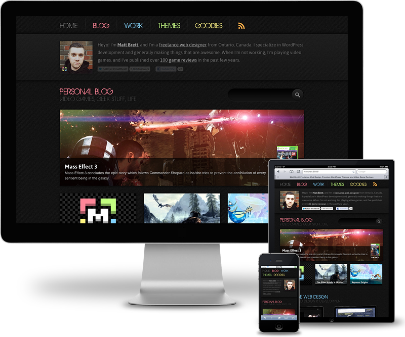
2012 Redesign
Web designers constantly have the urge to gut their own site, and start from scratch. Thankfully, my priorities keep me in check, and it’s usually every two or three years that I do a major overhaul. While I have other things I would have rather taken care of before a redesign (like getting some more WordPress themes on the market), I couldn’t help but feel that my site had become stagnant, and with all of my recent client projects supporting mobile platforms as well as desktop, the urge was eating away at me. After weeks of working 10-12 hour days and losing many weekends, I’m stoked to roll out this redesign, and am hoping it will reignite my blogging spark.

A New Identity
I’ve never really had a logo, or even consistent type that has represented or accompanied my online identity. There have been a few times when I wish I had something other than my face to use, so I decided to whip up a simple logo of sorts that fill this void.
Strip it Down, Throw it Out
Over the years and through the redesigns, my site had grown to a point that any major changes (and even updating certain content) required a fair amount of work. One of my main goals was to toss any content that wasn’t 100% necessary.
I previously had a section called Marketplace, where detailed theme pages lived. This was initially going to be a place where I would sell my own themes first hand, and even partner with some third parties to sell all sorts of digital goodies. It never quite panned out, and instead became a burden. Marketplace is out, Themes is in. And on the new Themes page, I simply link off to ThemeForest.
Similarly, the Work section has been condensed to a single page, not only to ease the content management end of things, but to provide a quicker look at my portfolio for the end user.
Simpler Design, Layout, and Content
This is the first design I’ve sported since 2005 that doesn’t look like someone beat the piss out of it. I still love a good grunge design, but wanted to take things in a bit of a different direction. “Simple” was a word I kept repeating back to myself as I worked on this iteration, and my goal was to apply it to all aspects of the site. My homepage has typically been an overview of my entire site, and a brief look at what I’m doing across the social networks. Most of this content still exists, but it’s been moved to the About page.
As I mentioned earlier, one of the reasons I really wanted to redesign my site, was to optimize it for mobile platforms. While I’ve only tested it on iOS devices, it should look decent on any modern tablet or phone. I didn’t cater to any specific devices or resolutions. Break points were addressed as problems occurred, which should result in a better all around experience.
At the time of writing, I’ve done extensive testing in iOS Simulator and in the browser at different sizes. I haven’t even thought about testing on Windows just yet, and things are likely out of sorts in Internet Explorer. I’ll get around to them at some point, but am in no hurry.
What Do You Think?
I’d love to hear how you’re feeling about this latest version of my site. Especially those who have been around for a while and are familiar with previous iterations. Drop me a line below in the comments, or ping me on Twitter.