Star Wars Jedi: Survivor
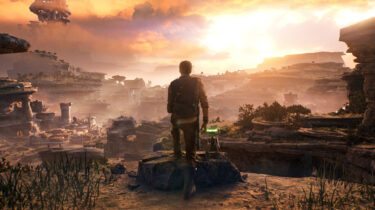
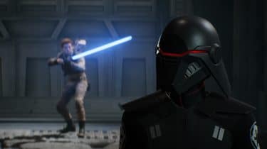
How do you top one of the best Star Wars games ever made? Respawn have done it in a lot of ways with the long-awaited sequel to Fallen Order.
How do you top one of the best Star Wars games ever made? Respawn have done it in a lot of ways with the long-awaited sequel to Fallen Order.
I don't really know how to describe it, but top-tier PlayStation exclusives are in a league of their own. I missed games with that level of fidelity and finesse.
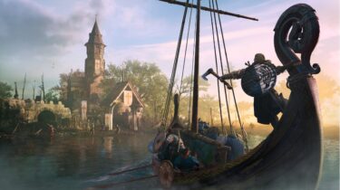
I had grown tired of the annual release cycle, but Assassin's Creed Valhalla is the best game in the franchise since Black Flag, as far as I'm concerned.
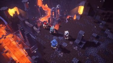
Minecraft Dungeons is a family-friendly loot-based dungeon crawler set in the Minecraft universe. While mining and crafting is absent, it absolutely looks, sounds, and feels like Minecraft.
Jedi: Fallen Order has turned things around for the franchise in the video game space and delivered an experience that is true to the source material and immensely satisfying.
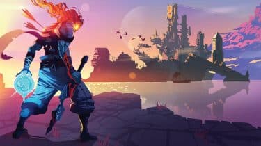
Dead Cells is a fantastic action platformer, with beautifully illustrated 2D landscapes and incredibly satisfying combat. Its risk and reward system will drive you insane, in the best way possible.
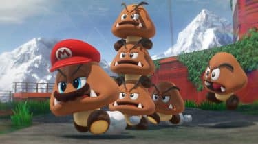
A fantastic entry in the long-running franchise that introduces exciting new mechanics, wonderful new kingdoms, and maintains the best-in-class platforming we’ve come to love and expect.

This is Spider-Man, unlike we've seen him in recent films and games. There's no origin story here, you dive right into the suit of an experienced and highly skilled webslinger.
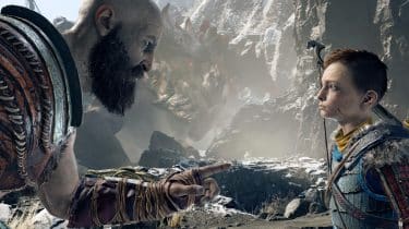
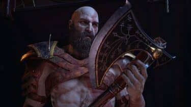
God of War is an absolute masterpiece. From its simple, yet compelling story, to its deep character development, to its methodical combat, to its breathtaking visuals and wonderful orchestral score.
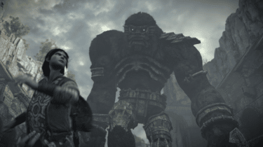
Shadow of the Colossus for PS4 is a masterpiece, and comes at a time when "games as a service" are consuming (and ruining) modern video games. I for one, needed this.
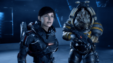
Set in a distant galaxy and 600 years after the events of the original trilogy, Mass Effect: Andromeda is a new adventure in a familiar universe.
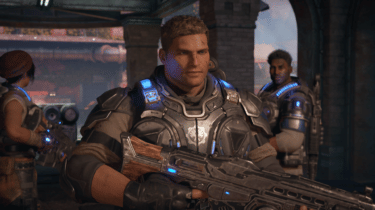
Having played all of the previous games in the series, Gears of War 4 feels like a homecoming of sorts. But that's not to say that newcomers aren't going to enjoy it just as much as veterans.